Getting started
Visualization with plotnine
Visualizing with plotnine
Importing plotnine
from siuba import *
from plotnine import *
Variables
billie = (
  track_features
  >> filter(_.artist == "Billie Eilish")
)Variables
(
  track_features
  >> filter(_.artist == "Billie Eilish")
)Variables
billie = (
  track_features
  >> filter(_.artist == "Billie Eilish")
)
Variables (result)
billie| artist | album | track_name | energy | valence | danceability | speechiness | acousticness | popularity | duration | |
|---|---|---|---|---|---|---|---|---|---|---|
| 1273 | Billie Eilish | dont smile ... | my boy | 0.3940 | 0.3240 | 0.692 | 0.2070 | 0.472 | 44 | 170.852 |
| 2899 | Billie Eilish | WHEN WE ALL... | listen befo... | 0.0561 | 0.0820 | 0.319 | 0.0450 | 0.935 | 79 | 242.652 |
| 2950 | Billie Eilish | lovely (wit... | lovely (wit... | 0.2960 | 0.1200 | 0.351 | 0.0333 | 0.934 | 89 | 200.186 |
| ... | ... | ... | ... | ... | ... | ... | ... | ... | ... | ... |
| 24857 | Billie Eilish | WHEN WE ALL... | ilomilo | 0.4230 | 0.5720 | 0.855 | 0.0585 | 0.724 | 79 | 156.371 |
| 24997 | Billie Eilish | WHEN I WAS ... | WHEN I WAS ... | 0.3320 | 0.0628 | 0.696 | 0.0425 | 0.853 | 71 | 270.520 |
| 25147 | Billie Eilish | come out an... | come out an... | 0.3210 | 0.1770 | 0.640 | 0.0931 | 0.693 | 74 | 210.376 |
27 rows × 10 columns
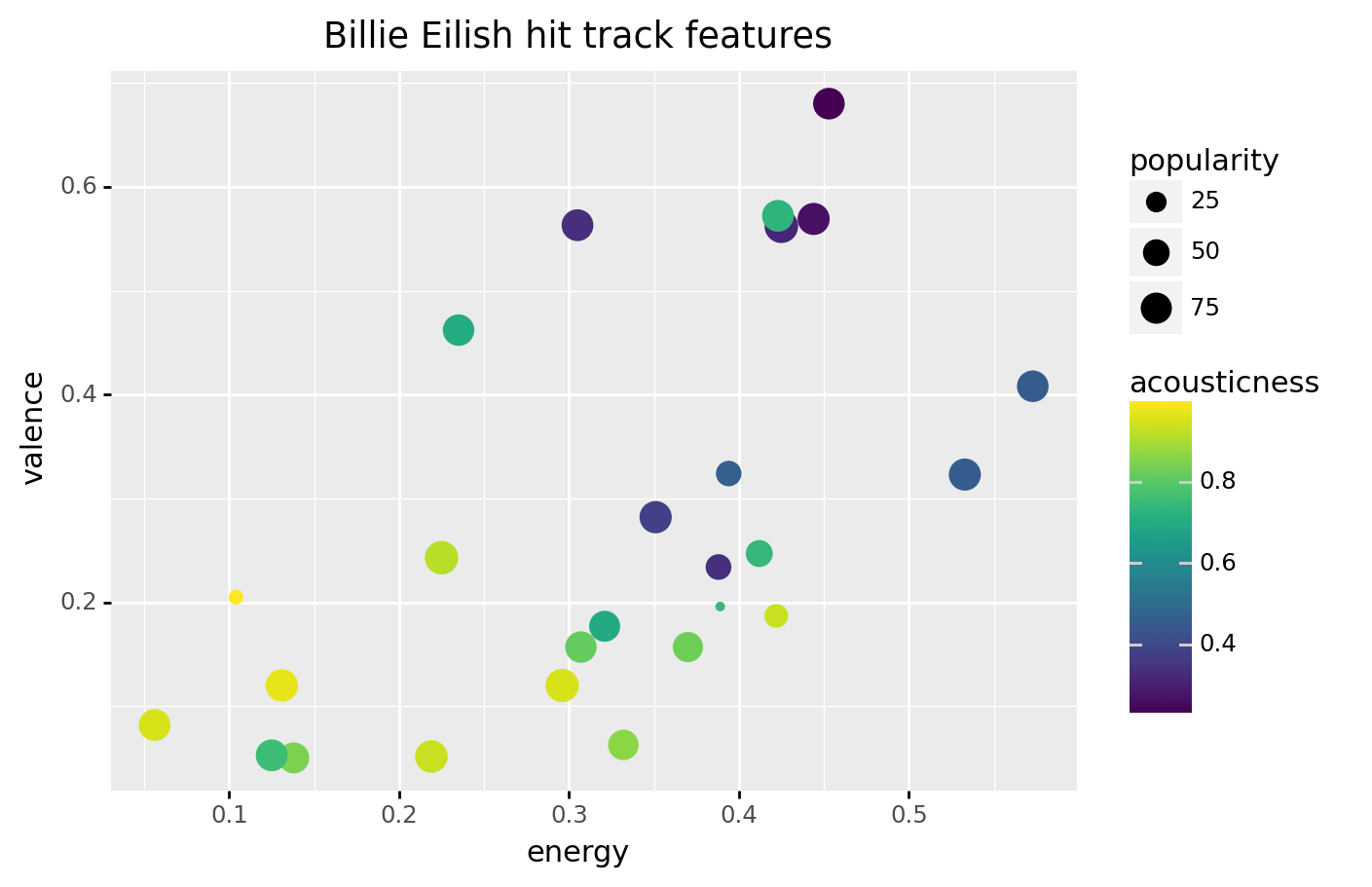
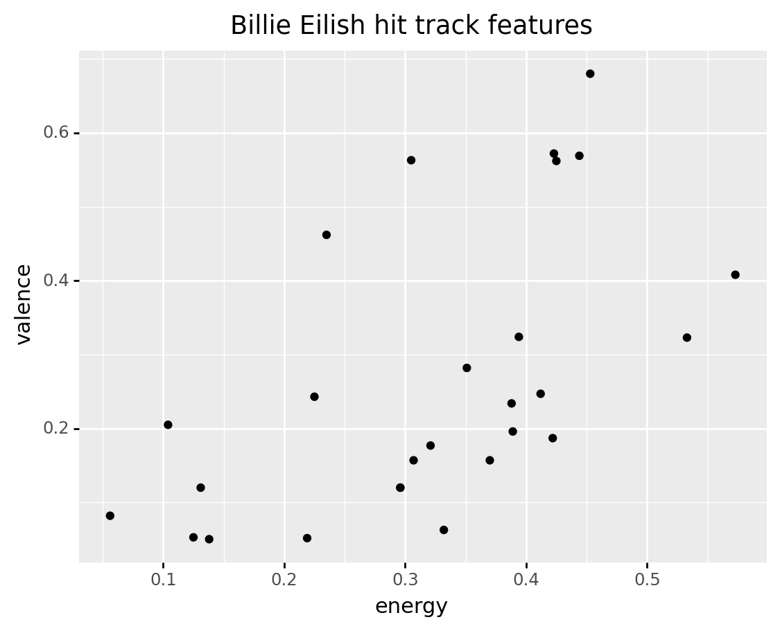
Visualizing with plotnine
(billie
 >> ggplot(aes("energy", "valence"))
  + geom_point()
  + labs(title = "Billie Eilish hit track features")
)
Visualizing with plotnine
(billie
 >> ggplot(aes("energy", "valence"))
  + geom_point()
  + labs(title = "Billie Eilish hit track features")
)
Visualizing with plotnine
(billie
 >> ggplot(aes("energy", "valence"))
  + geom_point()
  + labs(title = "Billie Eilish hit track features")
)
Visualizing with plotnine
(billie
 >> ggplot(aes("energy", "valence"))
  + geom_point()
  + labs(title = "Billie Eilish hit track features")
)
Let's practice!
Exercise 1:
In this exercise, there are two code cells. The first defines variables for tracks by different artists. The second creates a plot.
Read through the code and plot, and then modify it to answer the question beneath.
| artist | album | track_name | energy | valence | danceability | speechiness | acousticness | popularity | duration | |
|---|---|---|---|---|---|---|---|---|---|---|
| 1431 | ITZY | IT'z Different | 달라달라 (DALLA DALLA) | 0.853 | 0.713 | 0.790 | 0.0665 | 0.00116 | 73 | 199.874 |
| 21148 | ITZY | IT'z Different | 달라달라 DALLA DALLA | 0.853 | 0.713 | 0.790 | 0.0665 | 0.00116 | 57 | 199.874 |
| 22388 | ITZY | It'z Me | WANNABE | 0.911 | 0.640 | 0.809 | 0.0617 | 0.00795 | 81 | 191.242 |
| 25287 | ITZY | IT'z ICY | ICY | 0.904 | 0.814 | 0.801 | 0.0834 | 0.03240 | 72 | 191.142 |
4 rows × 10 columns
The code below plots hits for the roddy variable.
Note that you could swap out roddy for any of the other two variables above.
Who has the widest range of danceability? (i.e. biggist difference between highest and lowest)
(click to answer)
Exercise 2:
Does it look like there any extremely popular songs over 15 minutes long?
There is not one concrete answer to this question. Make a plot below, and come up with an answer you might share with another person.
hint
The duration column contains the length of each song in seconds. Use this with the popularity column.

possible answers
screencastExercise 3:
Does the lowest energy track belong to a "low energy" artist? In this exercise, we'll explore the questions using tracks by two artists.
Here is the track data sorted by energy.
| artist | album | track_name | energy | valence | danceability | speechiness | acousticness | popularity | duration | |
|---|---|---|---|---|---|---|---|---|---|---|
| 1003 | Simon Smith | Loops | Blagaslavlaju vas | 0.000778 | 0.000 | 0.779 | 0.4210 | 0.99400 | 0 | 36.038 |
| 5995 | DMS | Prepáčte | Nič | 0.000791 | 0.000 | 0.571 | 0.4460 | 0.95000 | 25 | 37.355 |
| 16689 | Peter Simon | Snowrain | Snowrain | 0.003480 | 0.373 | 0.472 | 0.0517 | 0.99600 | 0 | 31.000 |
| ... | ... | ... | ... | ... | ... | ... | ... | ... | ... | ... |
| 22695 | Nino Xypolitas | Epireastika | Eime Enas Allos - Original | 0.996000 | 0.517 | 0.644 | 0.1030 | 0.00346 | 34 | 214.693 |
| 17072 | Otira | Soundboy Burnin’ | Soundboy Burnin’ | 0.997000 | 0.327 | 0.568 | 0.2330 | 0.00299 | 14 | 173.846 |
| 11069 | Scooter | No Time To Chill | How Much Is the Fish? | 0.999000 | 0.615 | 0.533 | 0.0786 | 0.00130 | 48 | 226.200 |
25321 rows × 10 columns
Notice that Simon Smith has the lowest energy song ("Blagaslavlaju vas"), while Scooter has the highest energy song ("How Much is the Fish?").
First, filter the track_features data to create a variable named artist_low that has only tracks by the artist Simon Smith.
Next, create a variable named artist_high with tracks by the artist Scooter, who has the highest energy song.
Based on separate plots of their data, does the artist with the lowest energy track seem to have lower energy songs in general?
⚠️: Don't forget to replace all the blanks!
possible answer
The high energy artist, Scooter, seems to only have high energy songs (from about .9 to 1 energy).
On the other hand, the low energy artist, Simon Smith, seems to have a wide range of energy values (from about 0 to 1 energy).