Aesthetics
Using plotnine Aesthetics
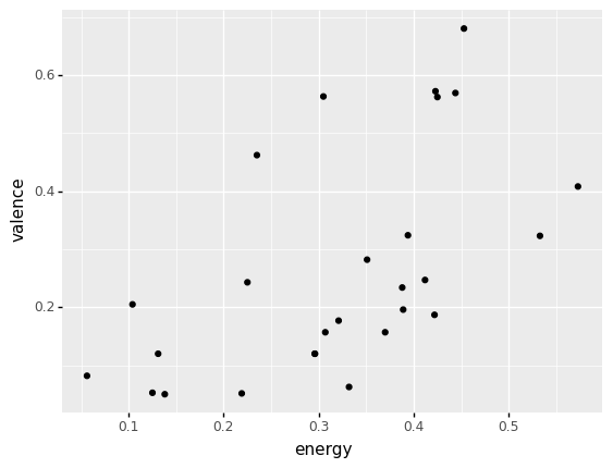
Scatterplots
(billie
  >> ggplot(aes("energy", "valence"))
   + geom_point()
)
Additional variables
billie| artist | album | track_name | energy | valence | danceability | speechiness | acousticness | popularity | duration | |
|---|---|---|---|---|---|---|---|---|---|---|
| 1273 | Billie Eilish | dont smile ... | my boy | 0.3940 | 0.3240 | 0.692 | 0.2070 | 0.472 | 44 | 170.852 |
| 2899 | Billie Eilish | WHEN WE ALL... | listen befo... | 0.0561 | 0.0820 | 0.319 | 0.0450 | 0.935 | 79 | 242.652 |
| 2950 | Billie Eilish | lovely (wit... | lovely (wit... | 0.2960 | 0.1200 | 0.351 | 0.0333 | 0.934 | 89 | 200.186 |
| ... | ... | ... | ... | ... | ... | ... | ... | ... | ... | ... |
| 24857 | Billie Eilish | WHEN WE ALL... | ilomilo | 0.4230 | 0.5720 | 0.855 | 0.0585 | 0.724 | 79 | 156.371 |
| 24997 | Billie Eilish | WHEN I WAS ... | WHEN I WAS ... | 0.3320 | 0.0628 | 0.696 | 0.0425 | 0.853 | 71 | 270.520 |
| 25147 | Billie Eilish | come out an... | come out an... | 0.3210 | 0.1770 | 0.640 | 0.0931 | 0.693 | 74 | 210.376 |
27 rows × 10 columns
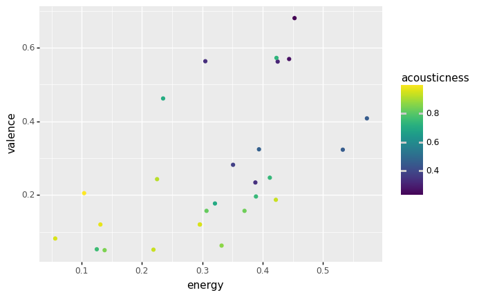
The color aesthetic
(billie
  >> ggplot(aes("energy", "valence", color = "acousticness"))
   + geom_point()
)
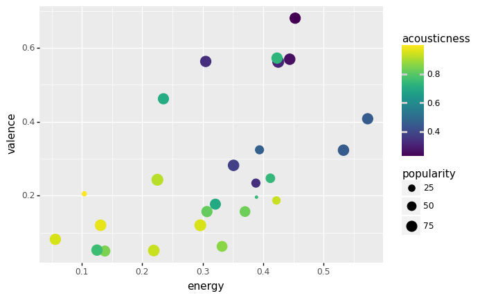
The size aesthetic
(billie
  >> ggplot(aes("energy", "valence", color = "acousticness", size = "popularity"))
   + geom_point()
)
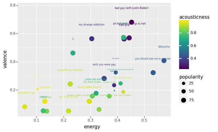
Aesthetics with multiple geoms
(billie
  >> ggplot(aes("energy", "valence",
                color = "acousticness", size = "popularity",
                label = "track_name"))
   + geom_point()
   + geom_text(nudge_y = .1)
)
Let's practice!
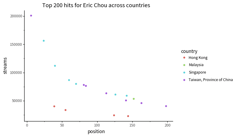
The plot below shows all top 200 hundred hits for Eric Chou across countries. Use the code cell below to recreate it.
(Note: running the code won't delete the plot!).
Exercise 2:
Use plots of the data for the artists Snelle, Bazzi, and Davyi, to answer the questions below.
You may need to write and run code multiple times, and produce multiple plots.
()
Test yourself
Which of these artists have hit tracks in the most continents?
(click to answer)
Test yourself
How many *countries* does Dayvi have hit tracks in?
(click to answer)