Facets
Faceting
You've learned to use color in your scatterplots.
Now you'll learn another way to explore your data. plotnine lets you divide your plot into subplots to get one smaller graph for each level of a variable.
This is called faceting, and it's another powerful way to communicate relationships within your data.
Faceting
asia_top200 = (
  music_top200
  >> filter(_.continent == "Asia")
)
asia_top200| country | position | track_name | artist | streams | duration | continent | |
|---|---|---|---|---|---|---|---|
| 4600 | Hong Kong | 1 | WANNABE | ITZY | 112648 | 191.242 | Asia |
| 4601 | Hong Kong | 2 | Intentions (feat. Quavo) | Justin Bieber | 104467 | 212.867 | Asia |
| 4602 | Hong Kong | 3 | Señorita | Shawn Mendes | 84196 | 190.960 | Asia |
| ... | ... | ... | ... | ... | ... | ... | ... |
| 12197 | Viet Nam | 198 | Đưa Nhau Đi Trốn (Chill Version) | Đen | 20750 | 241.959 | Asia |
| 12198 | Viet Nam | 199 | Hôm Nay Tôi Buồn | Phùng Khánh Linh | 20580 | 275.000 | Asia |
| 12199 | Viet Nam | 200 | Kick It | NCT 127 | 20495 | 233.013 | Asia |
2600 rows × 7 columns
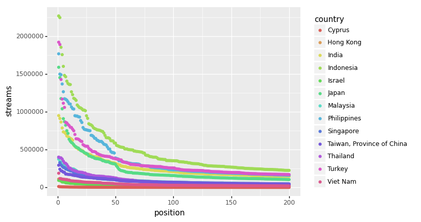
Faceting
(asia_top200
  >> ggplot(aes("position", "streams", color = "country"))
   + geom_point()
)
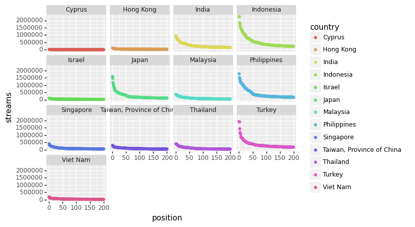
Faceting
(asia_top200
  >> ggplot(aes("position", "streams", color = "country"))
   + geom_point()
   + facet_wrap('~country')
)
Let's practice!
Exercise 1:
TODO
Exercise 2:
Below is the start of plotnine's documentation for facet_wrap.
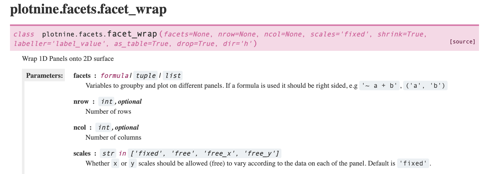
Notice that the Parameters section lists ncol and nrow options. These determine how many columns or rows to use. For example, the plot below has nrow = 1.
Try out the plot as is, and with the nrow argument changed to ncol = 1.
Then, answer the questions below.
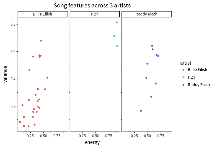
Which of the three artists tends to have the lowest valence?
(click to answer)
Which value seems easier to compare across facets, when ncol is set to 1?