Bar plots
Visualizing summarized data
When visualizing raw data doesn't work
(music_top200
  >> ggplot(aes("position", "streams", color = "country"))
   + geom_point()
)
Calculating min and max streams
by_position = (
  music_top200
  >> group_by(_.position)
  >> summarize(max_streams = _.streams.max(),
               min_streams = _.streams.min())
)
by_position| position | max_streams | min_streams | |
|---|---|---|---|
| 0 | 1 | 12987027 | 13604 |
| 1 | 2 | 9163134 | 10801 |
| 2 | 3 | 8043475 | 9510 |
| ... | ... | ... | ... |
| 197 | 198 | 1606234 | 1472 |
| 198 | 199 | 1606153 | 1470 |
| 199 | 200 | 1597824 | 1470 |
200 rows × 3 columns
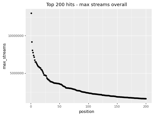
Plotting
(by_position
  >> ggplot(aes("position", "max_streams"))
   + geom_point()
   + labs(title = "Top 200 hits - max streams overall")
)Plotting (result)
(by_position
  >> ggplot(aes("position", "max_streams"))
   + geom_point()
   + labs(title = "Top 200 hits - max streams overall")
)
Starting y-axis at 0
(by_position
  >> ggplot(aes("position", "max_streams"))
   + geom_point()
   + expand_limits(y = 0)
   + labs(title = "Top 200 hits - max streams overall"))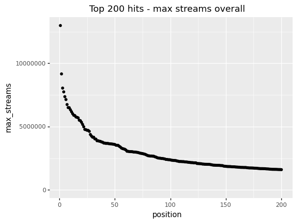
Calculating min and max streams
by_continent_position = (
  music_top200
  >> group_by(_.continent, _.position)
  >> summarize(max_streams = _.streams.max(),
               min_streams = _.streams.min())
)
by_continent_position| continent | position | max_streams | min_streams | |
|---|---|---|---|---|
| 0 | Africa | 1 | 94422 | 94422 |
| 1 | Africa | 2 | 74689 | 74689 |
| 2 | Africa | 3 | 67552 | 67552 |
| ... | ... | ... | ... | ... |
| 997 | Oceania | 198 | 225951 | 44570 |
| 998 | Oceania | 199 | 225492 | 44364 |
| 999 | Oceania | 200 | 225179 | 44291 |
1000 rows × 4 columns
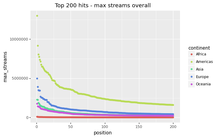
Visualize
(by_continent_position
  >> ggplot(aes("position", "max_streams", color = "continent"))
   + geom_point()
   + expand_limits(y = 0)
   + labs(title = "Top 200 hits - max streams overall"))