Course welcome
Introduction to siuba
Data Analysis
Meet the data: Spotify top 200

Meet the data: Spotify top 200
music_top200| country | position | track_name | artist | streams | duration | continent | |
|---|---|---|---|---|---|---|---|
| 0 | Argentina | 1 | Tusa | KAROL G | 1858666 | 200.960 | Americas |
| 1 | Argentina | 2 | Tattoo | Rauw Alejandro | 1344382 | 202.887 | Americas |
| 2 | Argentina | 3 | Hola - Remix | Dalex | 1330011 | 249.520 | Americas |
| ... | ... | ... | ... | ... | ... | ... | ... |
| 12397 | South Africa | 198 | Black And White | Niall Horan | 11771 | 193.090 | Africa |
| 12398 | South Africa | 199 | When I See U | Fantasia | 11752 | 217.347 | Africa |
| 12399 | South Africa | 200 | Psycho! | MASN | 11743 | 197.217 | Africa |
12400 rows × 7 columns
Meet the data: Spotify top 200
music_top200| country | position | track_name | artist | streams | duration | continent | |
|---|---|---|---|---|---|---|---|
| 0 | Argentina | 1 | Tusa | KAROL G | 1858666 | 200.960 | Americas |
| 1 | Argentina | 2 | Tattoo | Rauw Alejandro | 1344382 | 202.887 | Americas |
| 2 | Argentina | 3 | Hola - Remix | Dalex | 1330011 | 249.520 | Americas |
| ... | ... | ... | ... | ... | ... | ... | ... |
| 12397 | South Africa | 198 | Black And White | Niall Horan | 11771 | 193.090 | Africa |
| 12398 | South Africa | 199 | When I See U | Fantasia | 11752 | 217.347 | Africa |
| 12399 | South Africa | 200 | Psycho! | MASN | 11743 | 197.217 | Africa |
Meet the data: Spotify song features
Data Analysis
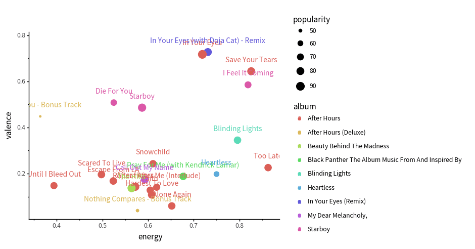
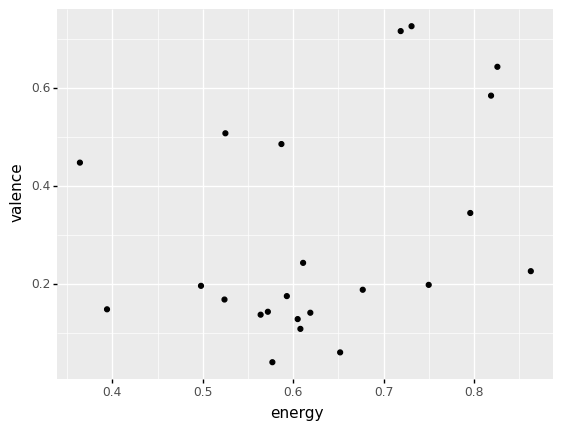
How code is structured
(track_features
  >> filter(_.artist == "The Weeknd")
  >> ggplot(aes("energy", "valence"))
   + geom_point()
)
How code is structured
(track_features
  >> filter(_.artist == "The Weeknd")


)| artist | album | track_name | energy | valence | danceability | speechiness | acousticness | popularity | duration | |
|---|---|---|---|---|---|---|---|---|---|---|
| 568 | The Weeknd | My Dear Melancholy, | Call Out My Name | 0.593 | 0.175 | 0.461 | 0.0356 | 0.17000 | 82 | 228.373 |
| 2753 | The Weeknd | Blinding Lights | Blinding Lights | 0.796 | 0.345 | 0.513 | 0.0629 | 0.00147 | 75 | 201.573 |
| 3004 | The Weeknd | In Your Eyes (Remix) | In Your Eyes (with Doja Cat) - Remix | 0.731 | 0.727 | 0.679 | 0.0319 | 0.00518 | 81 | 237.912 |
| ... | ... | ... | ... | ... | ... | ... | ... | ... | ... | ... |
| 23966 | The Weeknd | Beauty Behind The Madness | The Hills | 0.564 | 0.137 | 0.585 | 0.0515 | 0.06710 | 83 | 242.253 |
| 24688 | The Weeknd | Starboy | Starboy | 0.587 | 0.486 | 0.679 | 0.2760 | 0.14100 | 84 | 230.453 |
| 24982 | The Weeknd | After Hours | In Your Eyes | 0.719 | 0.717 | 0.667 | 0.0346 | 0.00285 | 91 | 237.520 |
23 rows × 10 columns
How code is structured
(track_features
  >> filter(_.artist == "The Weeknd")
  >> ggplot(aes("energy", "valence"))

)
How code is structured
(track_features
  >> filter(_.artist == "The Weeknd")
  >> ggplot(aes("energy", "valence"))
   + geom_point()
)
Let's practice!
Exercise 1: inspecting music data
Use the dropdown box below to change the code. Try choosing "United States" from the dropdown, then click run. This should return only the top 200 hits from the United States.
- :
| country | position | track_name | artist | streams | duration | continent | |
|---|---|---|---|---|---|---|---|
| 7800 | United States | 1 | The Box | Roddy Ricch | 12987027 | 196.653 | Americas |
| 7801 | United States | 2 | Myron | Lil Uzi Vert | 9163134 | 224.955 | Americas |
| 7802 | United States | 3 | Blueberry Faygo | Lil Mosey | 8043475 | 162.547 | Americas |
| ... | ... | ... | ... | ... | ... | ... | ... |
| 7997 | United States | 198 | Lights Up | Harry Styles | 1606234 | 172.227 | Americas |
| 7998 | United States | 199 | Without Me | Halsey | 1606153 | 201.661 | Americas |
| 7999 | United States | 200 | Enemies (feat. DaBaby) | Post Malone | 1597824 | 196.760 | Americas |
Test yourself
Which artist has a track in the second position on the United States charts?
(click to answer)
Exercise 2: inspecting track_features data
Use the options below, to examine tracks by different artists. Can you find the options that order tracks from highest energy to lowest?
- :
- :
| artist | album | track_name | energy | valence | danceability | speechiness | acousticness | popularity | duration | |
|---|---|---|---|---|---|---|---|---|---|---|
| 22431 | The Weeknd | After Hours (Deluxe) | Missed You - Bonus Track | 0.364 | 0.4480 | 0.716 | 0.0866 | 0.10700 | 48 | 144.540 |
| 3889 | The Weeknd | After Hours (Deluxe) | Nothing Compares - Bonus Track | 0.577 | 0.0398 | 0.524 | 0.0358 | 0.00253 | 49 | 222.307 |
| 17384 | The Weeknd | Heartless | Heartless | 0.750 | 0.1980 | 0.531 | 0.1110 | 0.00632 | 60 | 200.080 |
| ... | ... | ... | ... | ... | ... | ... | ... | ... | ... | ... |
| 9284 | The Weeknd | After Hours | After Hours | 0.572 | 0.1430 | 0.664 | 0.0305 | 0.08110 | 84 | 361.027 |
| 24689 | The Weeknd | Starboy | Starboy | 0.587 | 0.4860 | 0.679 | 0.2760 | 0.14100 | 84 | 230.453 |
| 24983 | The Weeknd | After Hours | In Your Eyes | 0.719 | 0.7170 | 0.667 | 0.0346 | 0.00285 | 91 | 237.520 |
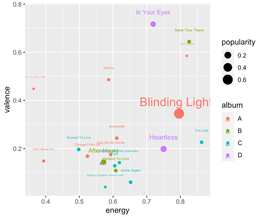
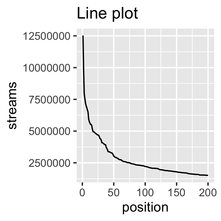
Exercise 3: Plotting track features
Here is one kind of plot you will learn to make in the course.
Once you've tried some options, scroll down and click next to get started with the first chapter!
- :
- :